Project Guidelines
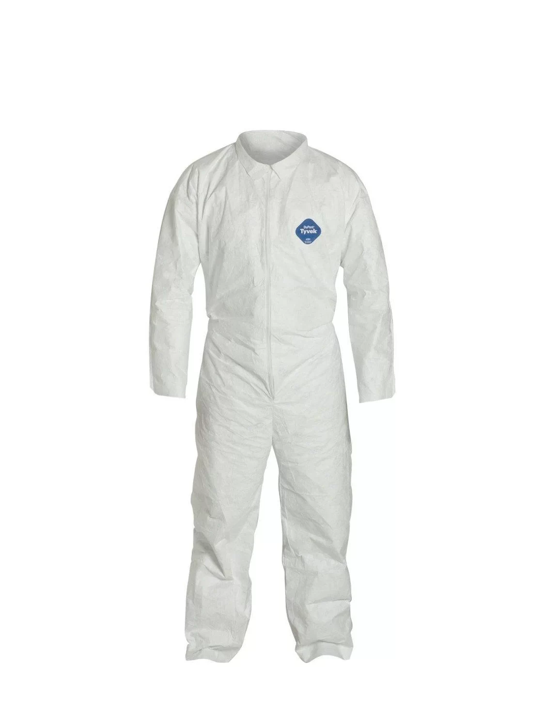
For this project we were assigned to use the 3D elements of design to create a Tyvek suit using sharpie markers. We were to design a suit that will draw the viewers eye around from one side of the suit to the other. When making the suit it is important to choose a theme to stick to as well as use repetition, pattern, contrast, scale, color, etc. Step one of the process was to come up with 3 suit ideas and brainstorm how the space around the suit could be used within that theme. My initial thoughts were things that interested me. I was thinking about doing a mashup of superhero suits, a mashup of different sports team’s jerseys, or a graffiti themed suit.
Making of the Suit
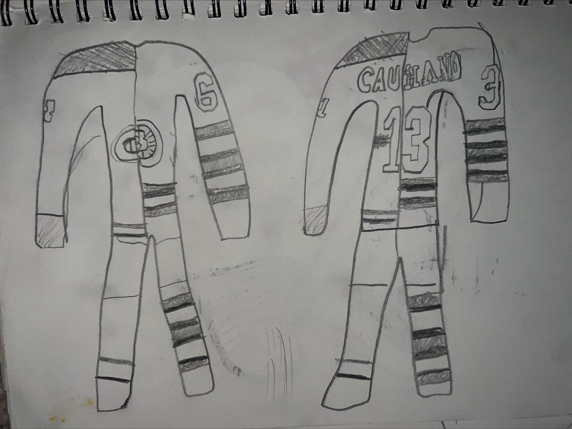
When I came up with my theme ideas I wanted to do something I was interested in. Playing hockey all my life instantly made me want to create a jersey type suit. I thought of many ways I could make jerseys from different teams flow into each other and emphasize the different unique aspects of each jersey. I made a maquette using two of my favorite team jerseys, but as I was making it I realized it was looking a bit too formal and symmetrical and not a freeform design. One of the requirements for the project is that it does not repeat any existing theme from movies or culture in general, so I decided that I was not going to go with this idea. I do not have it pictured, but the process was about the exact same for the superhero suit idea, as it would have been resembling a theme from movies and tv shows.
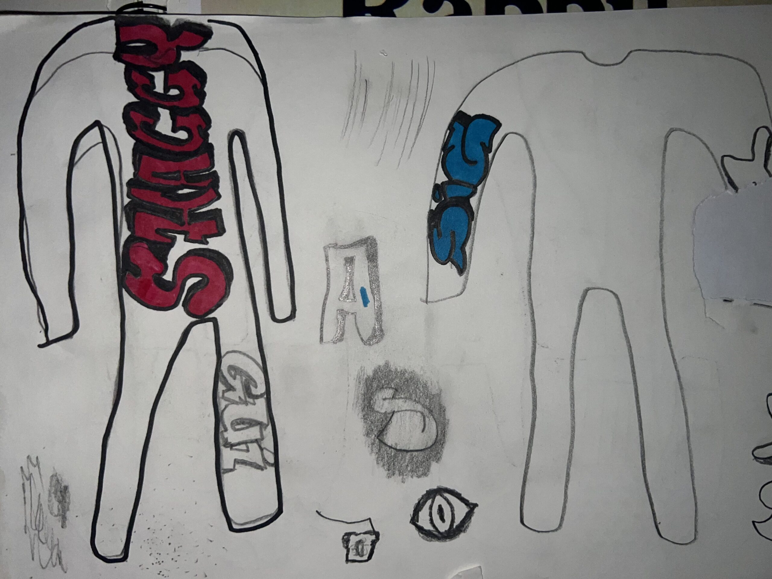
My breadwinner idea was my graffiti themed suit. I have always been interested in graffiti style, as I would always doodle bubble letters on any paper I got in grade school. I thought about how I could choose any word that I wanted and make it in graffiti letters. I thought this would be a cool way to use the space around the suit and the words would look like they are popping off the suit. I also thought about the bright bold color palette I could use and it interested me even more. In my maquette pictured on the left, I wrote SHAGGY (for my nickname) across the back piece, and I really liked the way it looked. On the first critique I showed this maquette and was told I should not place the words all vertically and try to make some horizontal or diagonal words that go around the body.
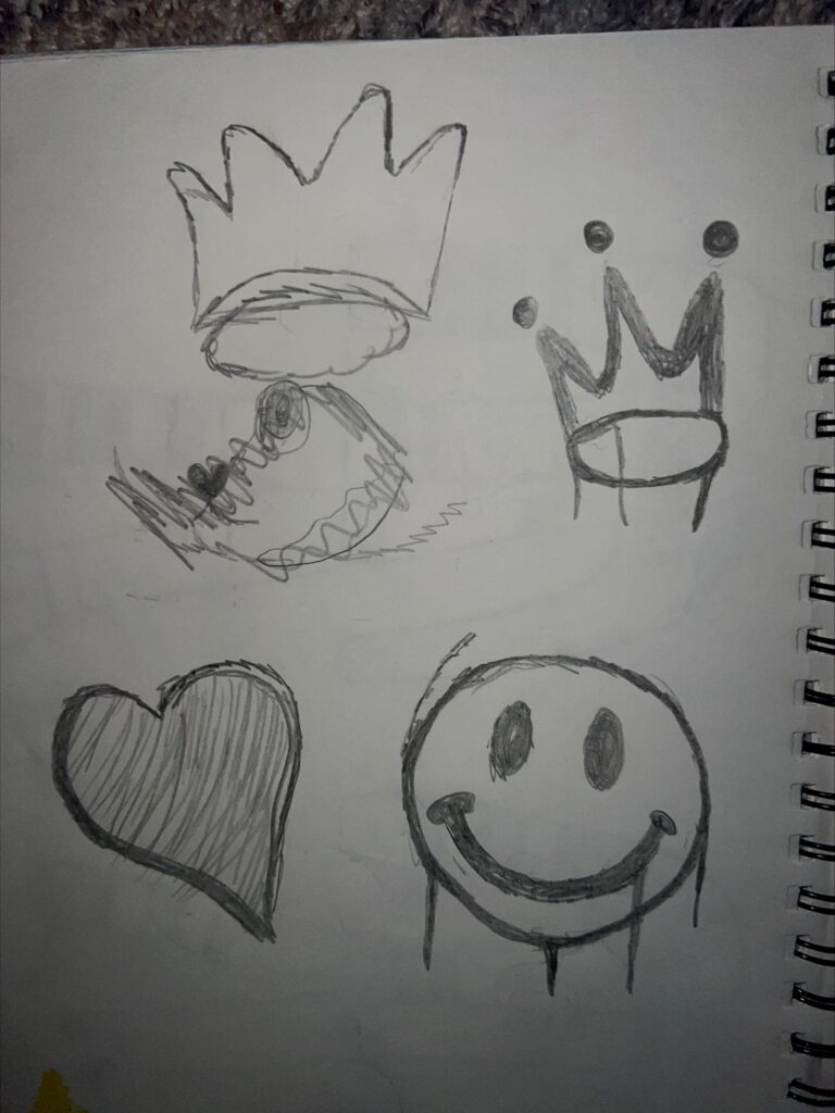
Incorporating Symbols
Now that I had a suit theme picked out and I had made a maquette for it, I needed to finalize what I wanted to put on the suit. I thought about how I would probably run out of ink in every marker if I tried to fill the entire suit with inked out words, so I came up with the idea of drawing classic graffiti symbols on the suit such as a crown, a heart, a smiley face, and other random icons you would see under a bridge. I could also use the symbols as a way to create more balance on the suit when making more words that take up most of the space. It was a way of giving the eye something to travel along while also keeping the main focal point of the suit on the words.
Final Suit
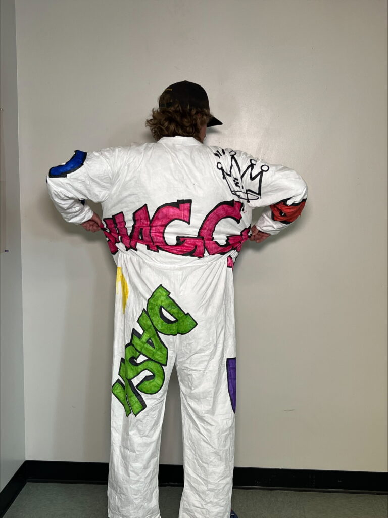
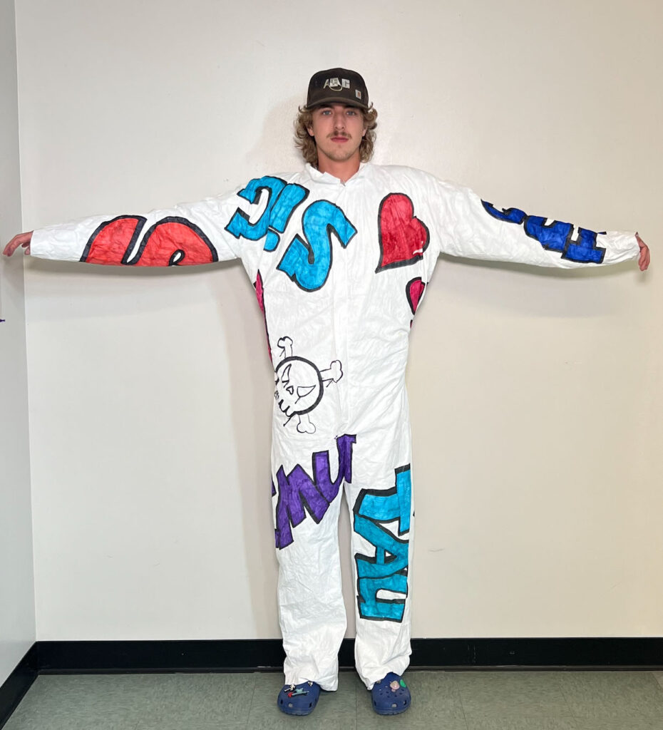
For my final suit, I combined all the previous elements I discussed into one finished product. I used many different colors to make the suit pop, and tried to accentuate the black lines to make the words look 3D. I took the advice from our critique and tried to completely randomize the way I placed the words on the suit. I think I used the space on the front of the suit well, but I could have added even more to some blank areas. I added symbols such as the heart and the skull on the front and I think it makes more of a complete look. My favorite part of the front is the word EMU in purple. I love the way I made the ‘M’ and how jagged and non-uniform it looks. I also made a giant ‘S’ on the right arm to represent the first letter of my name, and it also made me think of how the superman logo is just an ‘S’.
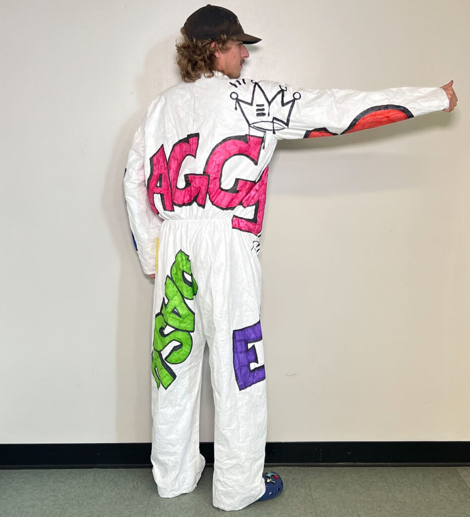
For my back side, I spent the most time filling up the word SHAGGY on the back. I wanted to make it look as if it was wrapping around my torso which I did in a way. It added to the gesture of the suit because it makes the viewer want to keep looking around the suit. I also wrote in the word DASH across the back of my left leg. I once again tried to put this word in a random direction and wrap the text a bit around the thigh. My favorite part on the back of the suit is the crown. I loved the way I made this pop, and I especially like the paint drips of black that I added. To level up the suit even more I think if I did this on all the words it would look more cohesive and uniform. I tried playing with the scale of the words in relation to the others, as shaggy is a lot larger than dash. It could have been even more powerful if I had scaled down some words to half if not more than half of that size and placed it in empty areas like the back of my right leg or left arm. I do think there is a good sense of flow in the suit and that not many words establish strong dominance to draw the eyes away from others. There is a pattern to notice but at the same time it is not repetitive.