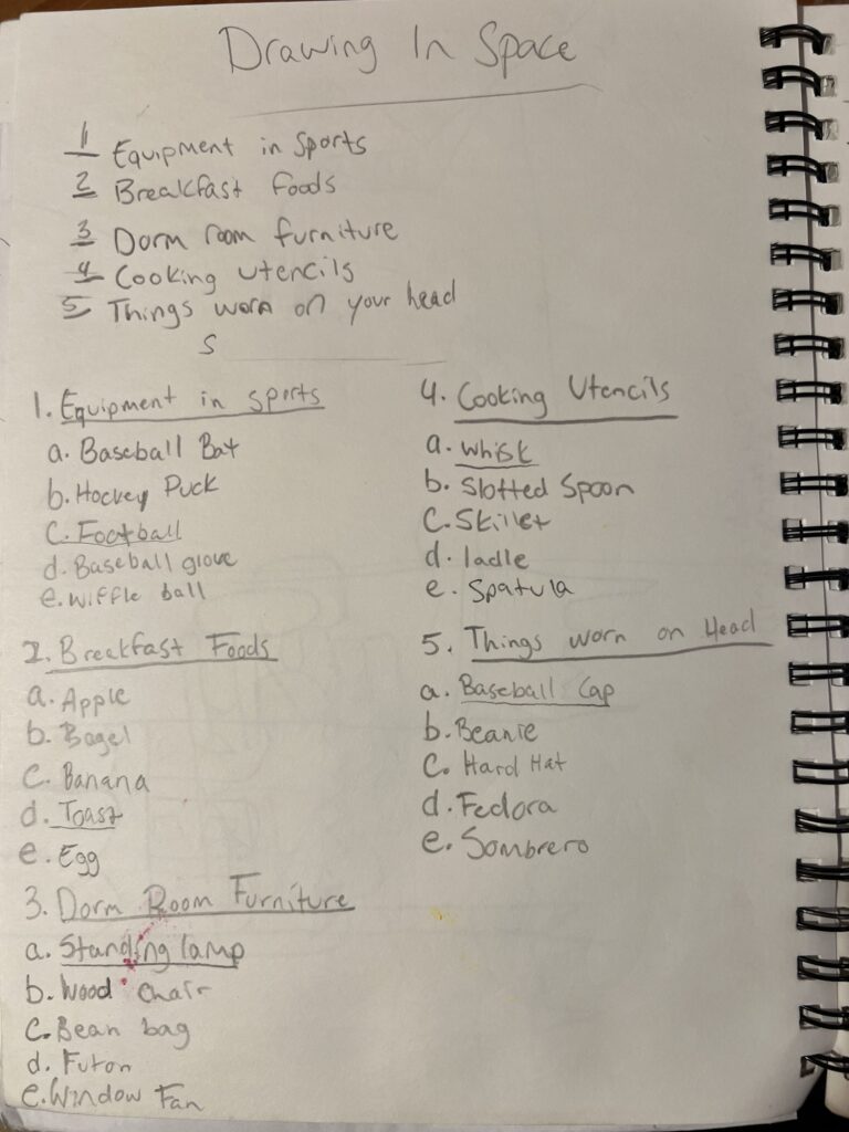
PROJECT DESCRIPTION:
This project was designed to experiment with creating depth in space in a drawing. The first step was to come up with a list of 5 groups of objects. Each thing should have a definite boundary. Then list 5 things or items for each group, ending with 25 combined. Compare and contrast items from each list and end with 1 item from each list. Lastly, create 4 sketches that use the objects you picked.
As seen in the image on the right, I made five contrasting lists and then wrote down 5 objects for each list. When making the lists I tried to pick objects that would be able to have depth when drawn. I underlined the items I found most interesting to me consisting of a football, a whisk, a baseball cap, a standing lamp, and a piece of toast. I then made sketches with these objects experimenting how I could position them to create depth.
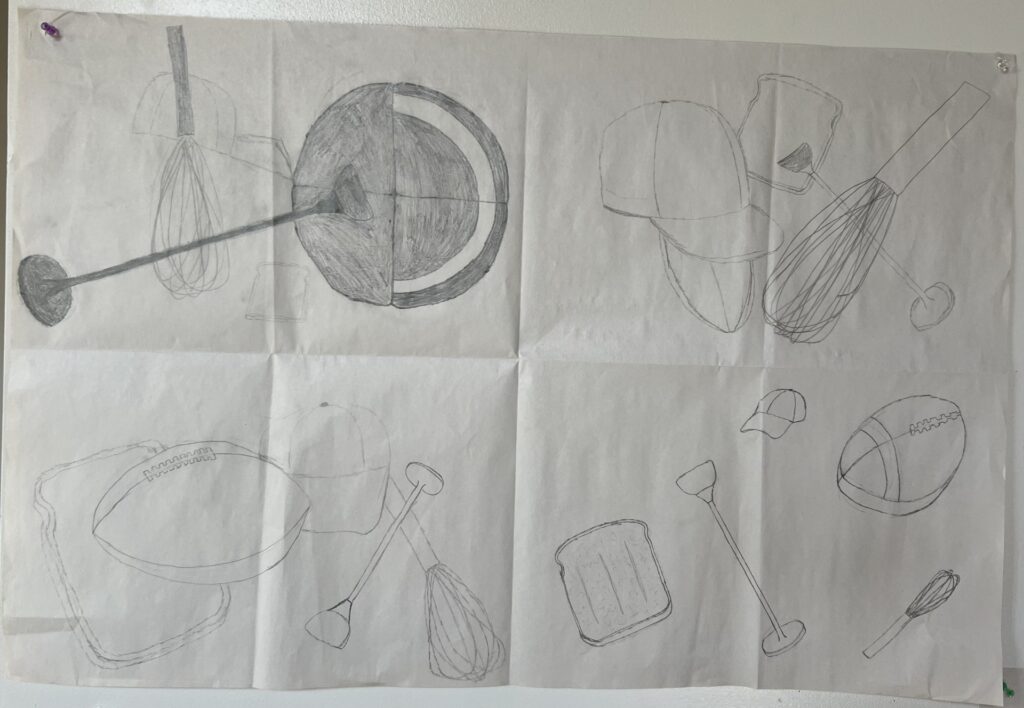
In my beginning sketches I did a good job with using different elements in each of my drawings, but I could have blended them together in all of the drawings better. For example, in the top left image, I did a good job with scale changes and overlapping, but I positioned the football in a poor position, and it becomes too much of a focal point. In the bottom right I did not use the element of overlapping well and spaced my objects too far apart. The top right sketch is strong but there is an issue with the objects grouping in the middle. The strongest sketch is the bottom left sketch. Each object has a strong sense of depth, the objects take up the whole frame without cropping, the objects overlap well, and there is a strong relation of scale and size within the objects.
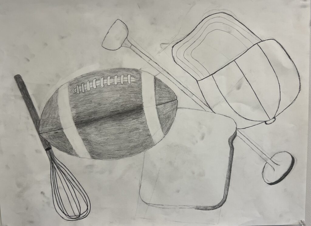
This is the start on my final drawing. I thought about my objects and really tried to think about filling up the entire frame, changing the scale of objects while keeping the sizes proportionate, and overlapping the objects in a subtle way. I think I did a good job blending all of these goals in my drawing. The toast is beginning to look good I just need to shade it more accent the depth, as with the hat a. I like the positioning of the whisk and how it looks as if it is behind the football.
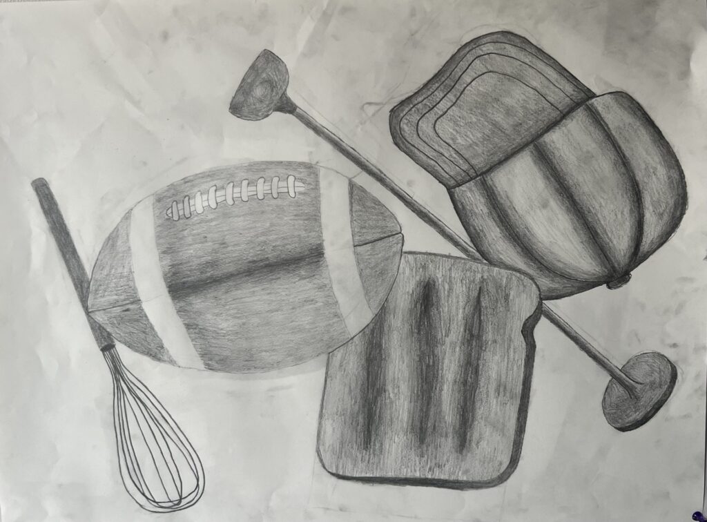
This image is my final composition. The objects I chose are all vastly different but create an interesting scene when blended together. Overall, I think my use of all the elements in this image is strong and I use the space well. I think the objects are shaded in a way that emphasizes the depth to them. The objects are overlapped subtly and almost touch the frame on each side. I like the way the hat is shaded, with the seams on the hat being emphasized heavily. Similarly, the lamp and the toast are shaded in a way that makes them pop off the page. I would have liked if the whisk was larger and more foreshortened, but the positioning is strong.